Branded HCP websites are like an ID of the brand — the first thing the doctor sees when they search for the brand. But how good are these websites?
We asked ourselves this question when we analyzed the engagement of the top 50 pharma websites for healthcare professionals (HCP).
In order to answer this question we recently did an analysis that included 2 things:
- We created an “HCP com” framework for assessing brand HCP websites
- We used the framework to assess the HCP websites of the 5 growth products for treating Atopic Dermatitis: Dupixent, Rinvoq (Abbvie), Cibinqo (Pfizer), Adbry (Leo Pharma), Opzelura (Incyte).
The framework is based on two key metrics: Ease of use and Usefulness.
Ease of Use
Why ease of use?
Ease of use is essential for HCP websites because it directly impacts HCP experience and engagement. A website that is not user-friendly can frustrate healthcare professionals and discourage them from exploring the website or taking any action.
A pharma website that is difficult to navigate can make visitors leave and result in lost prescription opportunities. A hard-to-use website can also harm the brand's image if HCPs may associate the bad experience with the overall quality of the company's products.
How we measured the ease of use
We aimed to have a measurable way of comparing website ease of use, even though "ease of use" might seem abstract. However, it's important to acknowledge that our definitions may not be flawless. We made a difficult decision to use the following standards and criteria for assessing the ease of use.
Metric | Criteria |
|---|---|
Intuitive Navigation | Navigation to all the content sections or pages is clear and easy throughout the website |
First Impression | Landing page is relevant, clear, useful, and communicates the ONE key benefit to the user |
Mobile Optimized | Based on the Mobile performance score by the PageSpeed Insights https://pagespeed.web.dev/ |
Clear Next Action | The call-to-action (CTA) elements to request a drug sample, contact rep/MSL or have a real-time chat are clear and they stand out |
We checked each website manually and evaluated them based on a scale from 1 to 3:
Sometimes it was difficult to decide between a score of 1 or 2 (we put a score of 1.5 in such cases), but we made sure to be consistent since we were seeking insights for ourselves.
The "mobile optimization" standard was the simplest to measure, as we used a score of 0 to 100 from Google Page Speed and converted it to a proportional score of 1 to 3.
We averaged the four metrics described earlier to create a single measurement for ease of use.
Usefulness
Why usefulness?
In the pharmaceutical industry, having a useful website is essential because it offers important details about pharma products.
A website that's not useful can create a bad experience and reduce trust in the brand. For instance, if a pharma site doesn't have crucial information like medication instructions or side effects, it can cause confusion or harm the patient.
How we measured the usefulness
Just like for ease of use, we aimed to have precise metrics for measuring pharmaceutical websites.
However, it's important to acknowledge that our definitions may not be flawless. As specialists who assist pharma companies in creating engaging content hubs, we used our knowledge to define the following standards and criteria for assessing usefulness:
Metric | Criteria |
|---|---|
Relevant Content | Website contains sufficient information on all of the following: product information, dosage, research and results. |
Useful patient support info | Website contains sufficient information on patient support (education, patient support program access, etc) |
Rich media content | The content is enriched with video, audio, charts, and infographics. |
Value proposition clarity | It's clear what the product is, its purpose, and its advantages compared to alternatives. |
We manually reviewed and assessed each website based on a scale of 1 to 3 for every criterion:
If the website fulfilled all the criteria, we gave it a score of 3.
If the website worked well but some issues, such as a clear value proposition but unclear advantages, we gave it a score of 2.
A score of 1 was given to websites that had some major issues, e.g. some of the essential information was missing.
We tried to be as accurate as possible, but it was difficult to differentiate between scores of 2 and 3 for some sites. Nevertheless, we aimed to be impartial and consistent with our metrics.
Like the ease of use, we used an average of the four metrics to create a single usefulness metric.
The analysis
Besides ease of use and usefulness, we also looked at another factor: how many people visited each product's website (using data from SimilarWeb).
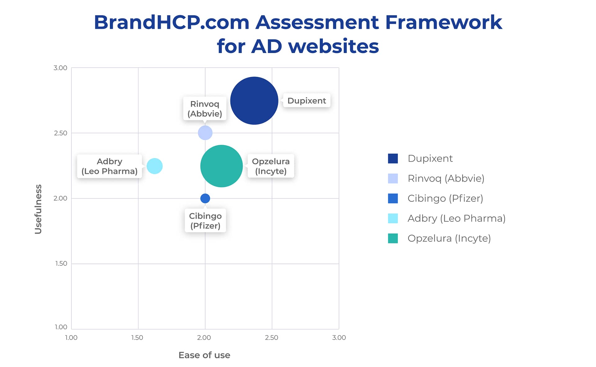
When we put all the information together, we found the following:

Here are some key points we observed:
- All Atopic Dermatitis websites are ranked in the upper half of the chart.
This means that they all have higher than average usefulness, with clear value propositions and engaging visuals.
- Dupixent is the winner
Dupixent is the top-performing product in all three metrics: ease of use, usefulness, and total traffic. However, its mobile optimization and the number of clicks to reach specific sections of the website could be improved.
- Cibinqo has the lowest Usefulness score and the lowest website traffic.
Cibinqo, a product from Pfizer, has the lowest usefulness score and the lowest website traffic.
The value proposition is too long, the mobile optimization is low, and the landing page is not easy to read, probably resulting in a less-than-positive".
- Adbry has the lowest Ease of use score.
Adbry from Leo Pharma has the lowest ease of use metric and is the only website on the left side of the chart.
The value proposition is not very clear, and the visual is a bit confusing. The first impression is not very good, and there are no clear CTAs on the homepage.
However, Adbry has the highest mobile optimization score among the top 5 products.
- (Bonus) “HCP com” framework passed our internal test in terms of ease of use and ability to analyze different branded HCP websites
Next Steps For You
3-STEP FREE GUIDE
How to Engage HCPs Using Neflix-Like Content Hubs
3-Step Guide to Engaging HCPs Using Netflix-Like Content Hubs